LIGHTEN(ed) UP(pers) - Exploring the Open Shelf Concept
Some friends of mine were house hunting last year. They spent every weekend going to open houses, looking for the perfect one. They were really excited about one in particular, it had a good location, two bathrooms, a big garage... let's just say it ticked off all their boxes.
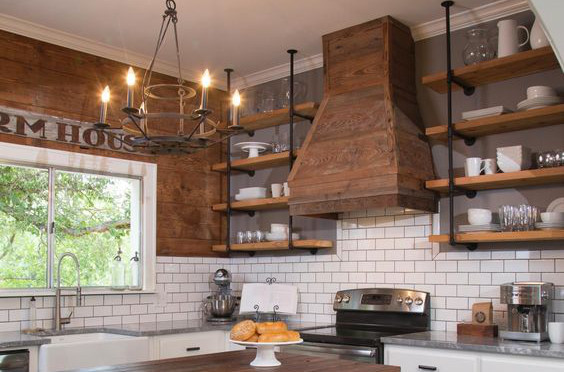
The one drawback for them (there's always one), was the kitchen cabinetry. Even though it was pretty obviously new, the uppers were all missing! They had been replaced with some open shelves and my friend just didn't know how she felt about it.
To be fair, it was not as cool as....
... but you get the idea. I was so glad she brought this up because it helped me really work through how I feel about this design trend.
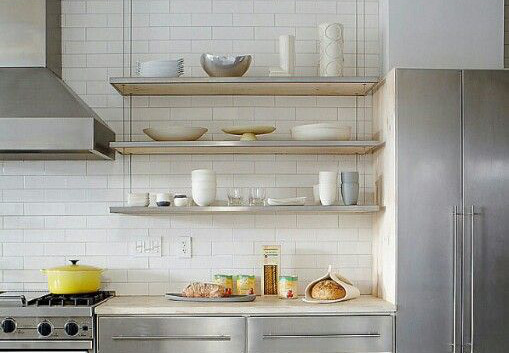
As the tile designer here at Concept II my first reason to ship this idea is kind of obvious. More often than not, the open shelf designs are an opportunity to feature more tile. The typical backsplash in a kitchen is only 18" and that is just not that much real estate. In the photo below, bringing the backsplash to the ceiling adds a subtle, clean background for all the other stand-out finishes in this sparkly kitchen.
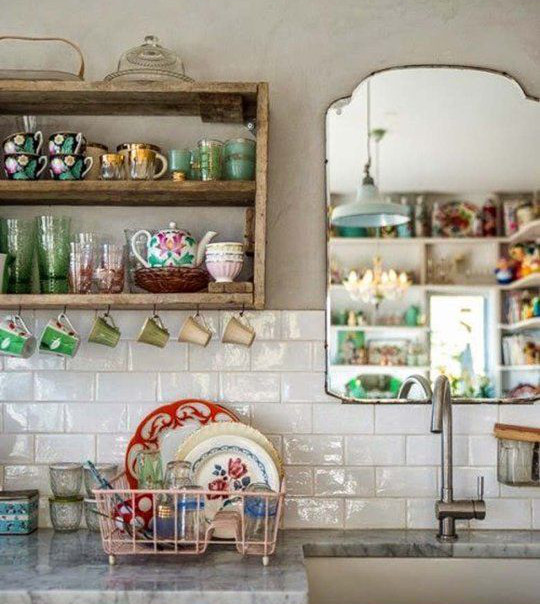
Another benefit would be the ability to show off all your cool stuff, pottery, copper, and glassware, and other curated treasures. I feel like we have all these pretty things that just live packed away in a box, or behind a closed cabinet door. It would be so much better to have them out, doing what they're supposed to do. With this, you have the flexibility to change the look of your kitchen, seasonally or just on a whim. Doesn't coffee taste better from your favorite Renaissance Festival mug? Wouldn't Grandma be thrilled that you're displaying that delft china collection? These items are tokens of where you've traveled, and you're individual taste & style. This is the perfect way to put a signature on the design, & these are the things that make you feel like you are home.
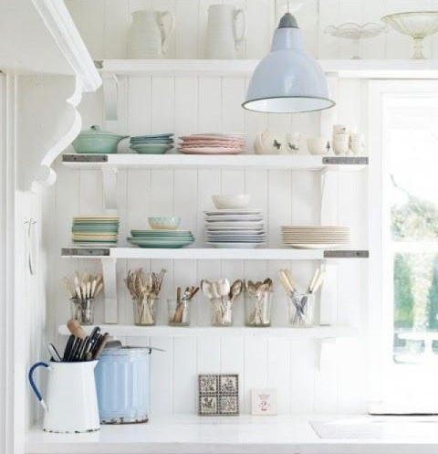
I had to include this one...
Some of the other pros are obvious, and their impact is immeasurable. The kitchen feels bigger and more open. The light can touch everything, so it's less dark and shadowy. The very best reason of all, you won't have to answer the question, "Where do we keep the mixing bowls?"
I know what you're going to say. What about the dust, and the dog hair, etc. This is where I can say that I'm not an outsider. I have some open storage solutions myself. Some of my pots hang, and my cutting boards & measuring cups are in view for all to see. Initially, this was a practical solution, not an aesthetic one. (My 100 year-old home 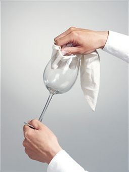 lacks cabinets, but has room for a baker's rack) Now I know, this really works for me. I don't need to rummage through a dark cabinet for what I'm looking for. I just grab it off the shelf, and give it a quick rinse, and I'm ready to chop. There, I said it, I rinse. I pretty much rinse everything before I use it. Even if it was in a cabinet. It's not a bad habit to get into. To be totally honest, I think this is a good practice even if something was in a closed cabinet. Just like a good restaurant polishes every wine glass before they pour, or people with glass shower doors use the squeegee after showering, the result is worth the tiny effort.
The truth is, the more cabinets you have, the more stuff you will acquire to fill them. If I have learned anything by cooking/entertaining in my adorable, cabinet-challenged colonial, it is that you can make it work with less. So when we eventually move, I won't be seduced by a kitchen with infinite cabinets. I know I only need 2 saucepans, 1 skillets, and 1 cutting board. It's proven, that having less stuff makes you happier.
Also, I think very important to mention. It doesn't have to be a "this or that" kind of choice. My favorite kitchen designs embrace the open shelf concept on one wall, and utilize the more conventional upper cabinets for the other. Check out our Pinterest board for more examples of "Lightened Uppers".


